.png?width=135&height=135&name=Chris(120).png)
Blog
e-Learning Interface Design Even a Four-Year Old Can Navigate
by Christopher Palm, media artist


by Christopher Palm, media artist
 Just about everyone has, at some point, experienced the perfect pair of jeans or managed to cook the perfect omelet. But how often can you say you’ve experienced the perfect e-learning interface? Sure, there are plenty of examples of great interface design, but perfection doesn’t exist in the graphic design world. If it did, every interface would look the same, would it not? Instead, we have a nearly infinite amount of visual characteristics to apply to content. From purple to red and every color in-between—from gradients to flat—from rounded corners to square. The “perfect” interface is indeed a subjective matter, but there are certain elements and best practices that can lead to a more universally accepted level of excellence.

It all comes down to content—and the interface is just a means to get to the content. Truly successful interface design will actually feel invisible to the user. When driving a car, the car’s interior is your interface. All of the controls are arranged in the most convenient way possible (most of the time), with the goal of keeping your eyes on the road (the content). While driving, this interface becomes invisible, even natural, and allows the content to take full focus.

Use a convertible for maximum content display
However, e-learning shouldn’t be a casual joy ride on a Sunday afternoon with the cruise control engaged. The sole purpose of e-learning is to teach. Do you remember driving school? If it was anything like my first couple experiences, it wasn’t pretty. It was stressful and frustrating at times, but also new and exciting—a learning experience that I can recall in crystal clear clarity even to this day.

Remember, the goal is to not hit pedestrians
Or how about the first time driving a new car? Or taking that fancy sports car you’ve always dreamed of for a spin? The controls will have felt familiar, but different enough to provide you with a certain sense of thrill and excitement, enticing you to drive forward.
So, while interface design should feel natural, it should also present a certain level of challenge and intrigue. It’s a narrow lane on a twisting mountain pass the graphic designer must navigate, often times drifting into the instructional design lane. Graphic design and instructional design often travel hand-in-hand—they have a common goal of providing the user with a sense of intrigue and exploration without becoming completely overwhelming. There is no perfect solution to this, and every situation is different. There may be many exceptions to this concept as well—but that challenge is part of what makes e-learning such a fascinating industry.
I’ve created countless interface designs over the years and still learn something new in the process each time. Best practices that I’ve arrived at can really be summed up in three words
Big.
 Yup, this will about do it
Not only does this mean using the maximum resolution you’re allowed, but also resisting the urge to eat-up that space with unnecessary chrome, branding, and logos. In e-learning, there may always be the need for certain navigation buttons, menus, or title space; but too often those few elements end up taking over nearly a full 3rd of the screen. It’s the equivalent of driving with the sun visor down for the entire trip.
Beautiful.

USDA Certified Organic
Take advantage of all that gorgeous new real-estate. Make your images full screen - edge to edge when possible. Use photography that looks natural and stunning. Give your text a healthy cushion of white space—don’t try and cram every bit of information into one screen. Spend some time developing how your course is going to feel to the learner. Give it a personality and make it unique—this isn’t your Grandmother’s Hyundai Excel.
Content.

Wait I thought this was a Bon Jovi concert
Your content has the center stage. Let it shine (please, not literally). Create interactions that put your content into context and use media to drive it there. The road is yours, where will it lead you?
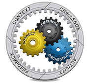 If you’re feeling particularly dangerous or have the need for speed, check out Dr. Michael Allen’s book, “Successful E-Learning Interface”. In this book he delves even deeper into this approach and demonstrates how to Connect with learners, how to Empower learning, and how to Orchestrate learning events for maximum impact using Context, Challenge, Activity, and Feedback (CCAF) Model.
Christopher Palm is a Media Artist at Allen Interactions with several years of experience in the e-learning industry. As a Media Artist, Christopher is responsible for creating intuitive and well-designed interfaces, interactions and graphics that lead to an immersive and engaging learning environment.
Comments
Would you like to leave a comment?
Related Blog Posts


Blog
mLearning Guidelines to Custom Interfacing and Touch-Based Interactions
by Christopher Palm, media artist

Blog
The Importance of Successful e-Learning Interface Design
by Christopher Palm, media artist